 |
| Facsimile of the 42-line Gutenberg bible from the copy at Berliner Staatsbibilothek Preuss. Kulturbesitz. Peagant, NY 1964 |
“Gutenberg has in fact invented nothing: Already in the middle of the second millennium BC it would have been possible to print books in that sense. All technical requirements (presses, ink, pagelike pads, also the art of casting negatives into metal) had been in place then. Nobody printed yet because they were not conscious that they would handle type when drawing letters.” Vilém Flusser, “Schrift”
The 42-line bible from Gutenberg’s printing shop is regarded as the first book to be printed with the newly invented book printing with movable type. Until today at least 48 copies have survived. The typography of this world-changing book is still viewed as one of the most beautiful to be typeset – if not the most beautiful.
Gutenberg’s typography shows indeed a significant difference to later typesetting: while later typesetters would use leading – small wedges of lead or brass – to adjust word-spacing to the length of the line, Gutenberg used a total of 290 different types, several for each letter, differing slightly in width. In respect to the page layout, Gutenberg kept thus much closer to the manuscript than later typesetters; aesthetically superior but far less efficient.
 |
| Above and below: Typography of the famous font-designer Hermann Zapf – set with TEX (Images from http://www-cs-faculty.stanford.edu/~uno/). |
 |
When I studied mathematics in the early nineties, many of the newer text books were so ugly that I had difficulties to comprehend their content; the shabby quality of typography and reproduction in those times made the nerdy science of maths even more unattractive. The reason for this decline in publication culture lies in the change from hot type to photo setting. In the modern setting machines – still partly mechanic or based on not-so-fast computers – creating such complicated formulae, multi-lined by indexes and superscripts, that characterise mathematics was not provided or just impossible. So usually it would be copying and binding simple computer prints or typewriter scripts with the formulae put in handwriting or drawn with a stencil. For the first time in 500 years publishers had departed from Gutenberg’s technology and some contemporary thinkers like Vilém Flusser even heralded the end of printing.
But not all books were that ugly. From time to time there appeared real pearls of typographic culture amongst the new editions – also in niche fields, in very small circulations, even with doctor or master theses there was a sudden surge in quality – at least regarding the look of the texts.
This is the merit of Donald E. Knuth: 
 |
| His book “The Art of Computer Programming” gave the occasion for Donald E. Knuth to systematically explore digital typography. The result justifies the labour! |
Knuth – on of the pioneers of computer programming – in a decade’s work had written a typesetting software, from which he requested at least the same power and quality as from the great Monotype hot-setting machines. The story of this software is told by Donald Knuth himself: disappointed by the bad quality of his book’s second edition, he had begun to work into typography and printing and not stopped before he would have been able to present the perfect solution – which he published under permissive Free Software Licence.
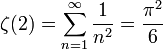
| The notation of complicated formulae in TEX is easily to be learnt. The special characters are preceded by a \-tag. Superscripts and subscripts just come one after the other.
\sum makes the summation-sign Σ Here is an example for the simplified TEX-version built into Wikipedia: Riemann’s ζ-function. In TEX-Code:
results in the image: |
 |
| … or for s=2, with the famous relation to the circle:
|
 |
What is special about TEX in my view is not so much its easy way to insert mathematical formulae into the text to look just like they did when engraved into steel. TEX typesets the pages in such an aesthetic way like the best hot-set compositors where able to do manually, and that with any type, font, symbol, right to left – just like the text would require.
Aside from the actual typesetting software, TEX comes with a tool for font management: METAFONT. Knuth represented – in difference from his predecessors – the letters not as bitmap, that means as grid of black and white squares, but describes the types as mathematical equations, as curves of functions. This approach is now followed by all typesetting systems – Adobe’s Postscript and pdf as well as Microsoft’s Truetype – with an important exception: in these the outline of the letter are prescribed by the curves, while Knuth prescribed the “stroke of a brush” – a centerline and the outline of the brush in the form of an ellipse.
 |
| “The Art of Computer Programming” by Donald E. Knuth is not only printed nicely but also bound nicely – cloth binding with thread-stiching, as it is good manners … |
Typography was the most important and most demanding part of book production in all the five hundred years since Gutenberg. This had not been changed by the mechanisation with Linotype or Monotype – it was fine art to produce text with machines in a way that would at least cope with the value of the content. To command technology – and not the other way round – is as prevailing today as in Gutenberg’s time. TEX translates the essentials of this technology into digital media production.
After the content, good typography and layout are the second step, necessary for a valuable text. Then comes the actual production – from paper production, printing, to binding – respectively the display on screen – and the distribution. all theses steps pay into the value of a medium. In every of these carefulness is worthwhile.
 |
| “Never before, the progress has been so breathless as since the invention of the imaging contraptions.” Vilém Flusser: “Schrift” (the picture is taken from Donald E. Knuth, Digital Typography) |
One reply on “TEX – Digital Typesetting”
[…] [Read this post in English] […]